组件基础 | Components Basics
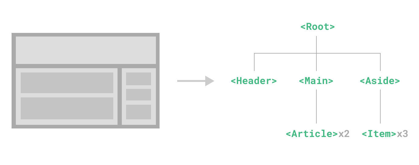
Components allow us to split the UI into independent and reusable pieces, and think about each piece in isolation. It's common for an app to be organized into a tree of nested components:
组件允许我们将 UI 划分为独立的、可重用的部分,并且可以对每个部分进行单独的思考。在实际应用中,组件常常被组织成一个层层嵌套的树状结构:
This is very similar to how we nest native HTML elements, but Vue implements its own component model that allows us to encapsulate custom content and logic in each component. Vue also plays nicely with native Web Components. If you are curious about the relationship between Vue Components and native Web Components, read more here.
这和我们嵌套 HTML 元素的方式类似,Vue 实现了自己的组件模型,使我们可以在每个组件内封装自定义内容与逻辑。Vue 同样也能很好地配合原生 Web Component。如果你想知道 Vue 组件与原生 Web Components 之间的关系,可以阅读此章节。
定义一个组件 | Defining a Component
When using a build step, we typically define each Vue component in a dedicated file using the .vue extension - known as a Single-File Component (SFC for short):
当使用构建步骤时,我们一般会将 Vue 组件定义在一个单独的 .vue 文件中,这被叫做单文件组件 (简称 SFC):
vue
<script setup>
import { ref } from 'vue'

const count = ref(0)
</script>

<template>
  <button @click="count++">You clicked me {{ count }} times.</button>
</template>
When not using a build step, a Vue component can be defined as a plain JavaScript object containing Vue-specific options:
当不使用构建步骤时,一个 Vue 组件以一个包含 Vue 特定选项的 JavaScript 对象来定义:
js
import { ref } from 'vue'

export default {
  setup() {
    const count = ref(0)
    return { count }
  },
  template: `
    <button @click="count++">
      You clicked me {{ count }} times.
    </button>`
  // Can also target an in-DOM template:
  // template: '#my-template-element'
  // 也可以针对一个 DOM 内联模板:
  // template: '#my-template-element'
}
The template is inlined as a JavaScript string here, which Vue will compile on the fly. You can also use an ID selector pointing to an element (usually native <template> elements) - Vue will use its content as the template source.
这里的模板是一个内联的 JavaScript 字符串,Vue 将会在运行时编译它。你也可以使用 ID 选择器来指向一个元素 (通常是原生的 <template> 元素),Vue 将会使用其内容作为模板来源。
The example above defines a single component and exports it as the default export of a .js file, but you can use named exports to export multiple components from the same file.
上面的例子中定义了一个组件,并在一个 .js 文件里默认导出了它自己,但你也可以通过具名导出在一个文件中导出多个组件。
使用组件 | Using a Component
TIP
We will be using SFC syntax for the rest of this guide - the concepts around components are the same regardless of whether you are using a build step or not. The Examples section shows component usage in both scenarios.
我们会在接下来的指引中使用单文件组件语法,无论你是否使用构建步骤,组件相关的概念都是相同的。示例一节中展示了两种场景中的组件使用情况。
To use a child component, we need to import it in the parent component. Assuming we placed our counter component inside a file called ButtonCounter.vue, the component will be exposed as the file's default export:
要使用一个子组件,我们需要在父组件中导入它。假设我们把计数器组件放在了一个叫做 ButtonCounter.vue 的文件中,这个组件将会以默认导出的形式被暴露给外部。
vue
<script setup>
import ButtonCounter from './ButtonCounter.vue'
</script>

<template>
  <h1>Here is a child component!</h1>
  <ButtonCounter />
</template>
With <script setup>, imported components are automatically made available to the template.
通过 <script setup>,导入的组件都在模板中直接可用。
It's also possible to globally register a component, making it available to all components in a given app without having to import it. The pros and cons of global vs. local registration is discussed in the dedicated Component Registration section.
当然,你也可以全局地注册一个组件,使得它在当前应用中的任何组件上都可以使用,而不需要额外再导入。关于组件的全局注册和局部注册两种方式的利弊,我们放在了组件注册这一章节中专门讨论。
Components can be reused as many times as you want:
组件可以被重用任意多次:
template
<h1>Here is a child component!</h1>
<ButtonCounter />
<ButtonCounter />
<ButtonCounter />Notice that when clicking on the buttons, each one maintains its own, separate count. That's because each time you use a component, a new instance of it is created.
你会注意到,每当点击这些按钮时,每一个组件都维护着自己的状态,是不同的 count。这是因为每当你使用一个组件,就创建了一个新的实例。
In SFCs, it's recommended to use PascalCase tag names for child components to differentiate from native HTML elements. Although native HTML tag names are case-insensitive, Vue SFC is a compiled format so we are able to use case-sensitive tag names in it. We are also able to use /> to close a tag.
在单文件组件中,推荐为子组件使用 PascalCase 的标签名,以此来和原生的 HTML 元素作区分。虽然原生 HTML 标签名是不区分大小写的,但 Vue 单文件组件是可以在编译中区分大小写的。我们也可以使用 /> 来关闭一个标签。
If you are authoring your templates directly in a DOM (e.g. as the content of a native <template> element), the template will be subject to the browser's native HTML parsing behavior. In such cases, you will need to use kebab-case and explicit closing tags for components:
如果你是直接在 DOM 中书写模板 (例如原生 <template> 元素的内容),模板的编译需要遵从浏览器中 HTML 的解析行为。在这种情况下,你应该需要使用 kebab-case 形式并显式地关闭这些组件的标签。
template
<!-- if this template is written in the DOM -->
<!-- 如果是在 DOM 中书写该模板 -->
<button-counter></button-counter>
<button-counter></button-counter>
<button-counter></button-counter>
See in-DOM template parsing caveats for more details.
请看 DOM 内模板解析注意事项了解更多细节。
传递 props | Passing Props
If we are building a blog, we will likely need a component representing a blog post. We want all the blog posts to share the same visual layout, but with different content. Such a component won't be useful unless you can pass data to it, such as the title and content of the specific post we want to display. That's where props come in.
如果我们正在构建一个博客,我们可能需要一个表示博客文章的组件。我们希望所有的博客文章分享相同的视觉布局,但有不同的内容。要实现这样的效果自然必须向组件中传递数据,例如每篇文章标题和内容,这就会使用到 props。
Props are custom attributes you can register on a component. To pass a title to our blog post component, we must declare it in the list of props this component accepts, using the defineProps macro:
Props 是一种特别的 attributes,你可以在组件上声明注册。要传递给博客文章组件一个标题,我们必须在组件的 props 列表上声明它。这里要用到 defineProps 宏:
vue
<!-- BlogPost.vue -->
<script setup>
defineProps(['title'])
</script>

<template>
  <h4>{{ title }}</h4>
</template>
defineProps is a compile-time macro that is only available inside <script setup> and does not need to be explicitly imported. Declared props are automatically exposed to the template. defineProps also returns an object that contains all the props passed to the component, so that we can access them in JavaScript if needed:
defineProps 是一个仅 <script setup> 中可用的编译宏命令,并不需要显式地导入。声明的 props 会自动暴露给模板。defineProps 会返回一个对象,其中包含了可以传递给组件的所有 props:
js
const props = defineProps(['title'])
console.log(props.title)
See also: Typing Component Props
TypeScript 用户请参考:为组件 props 标注类型
If you are not using <script setup>, props should be declared using the props option, and the props object will be passed to setup() as the first argument:
如果你没有使用 <script setup>,props 必须以 props 选项的方式声明,props 对象会作为 setup() 函数的第一个参数被传入:
js
export default {
  props: ['title'],
  setup(props) {
    console.log(props.title)
  }
}
A component can have as many props as you like and, by default, any value can be passed to any prop.
一个组件可以有任意多的 props,默认情况下,所有 prop 都接受任意类型的值。
Once a prop is registered, you can pass data to it as a custom attribute, like this:
当一个 prop 被注册后,可以像这样以自定义 attribute 的形式传递数据给它:
template
<BlogPost title="My journey with Vue" />
<BlogPost title="Blogging with Vue" />
<BlogPost title="Why Vue is so fun" />
In a typical app, however, you'll likely have an array of posts in your parent component:
在实际应用中,我们可能在父组件中会有如下的一个博客文章数组:
js
const posts = ref([
  { id: 1, title: 'My journey with Vue' },
  { id: 2, title: 'Blogging with Vue' },
  { id: 3, title: 'Why Vue is so fun' }
])
Then want to render a component for each one, using v-for:
这种情况下,我们可以使用 v-for 来渲染它们:
template
<BlogPost
  v-for="post in posts"
  :key="post.id"
  :title="post.title"
/>Notice how v-bind syntax (:title="post.title") is used to pass dynamic prop values. This is especially useful when you don't know the exact content you're going to render ahead of time.
留意我们是如何使用 v-bind 语法 (:title="post.title") 来传递动态 prop 值的。当事先不知道要渲染的确切内容时,这一点特别有用。
That's all you need to know about props for now, but once you've finished reading this page and feel comfortable with its content, we recommend coming back later to read the full guide on Props.
以上就是目前你需要了解的关于 props 的全部了。如果你看完本章节后还想知道更多细节,我们推荐你深入阅读关于 props 的完整指引。
监听事件 | Listening to Events
As we develop our <BlogPost> component, some features may require communicating back up to the parent. For example, we may decide to include an accessibility feature to enlarge the text of blog posts, while leaving the rest of the page at its default size.
让我们继续关注我们的 <BlogPost> 组件。我们会发现有时候它需要与父组件进行交互。例如,要在此处实现无障碍访问的需求,将博客文章的文字能够放大,而页面的其余部分仍使用默认字号。
In the parent, we can support this feature by adding a postFontSize ref:
在父组件中,我们可以添加一个 postFontSize ref 来实现这个效果:
js
const posts = ref([
  /* ... */
])

const postFontSize = ref(1)
Which can be used in the template to control the font size of all blog posts:
在模板中用它来控制所有博客文章的字体大小:
template
<div :style="{ fontSize: postFontSize + 'em' }">
  <BlogPost
    v-for="post in posts"
    :key="post.id"
    :title="post.title"
   />
</div>
Now let's add a button to the <BlogPost> component's template:
然后,给 <BlogPost> 组件添加一个按钮:
vue
<!-- BlogPost.vue, omitting <script> -->
<!-- BlogPost.vue, 省略了 <script> -->
<template>
  <div class="blog-post">
    <h4>{{ title }}</h4>
    <button>Enlarge text</button>
  </div>
</template>
The button doesn't do anything yet - we want clicking the button to communicate to the parent that it should enlarge the text of all posts. To solve this problem, components provide a custom events system. The parent can choose to listen to any event on the child component instance with v-on or @, just as we would with a native DOM event:
这个按钮目前还没有做任何事情,我们想要点击这个按钮来告诉父组件它应该放大所有博客文章的文字。要解决这个问题,组件实例提供了一个自定义事件系统。父组件可以通过 v-on 或 @ 来选择性地监听子组件上抛的事件,就像监听原生 DOM 事件那样:
template
<BlogPost
  ...
  @enlarge-text="postFontSize += 0.1"
 />
Then the child component can emit an event on itself by calling the built-in $emit method, passing the name of the event:
子组件可以通过调用内置的 $emit 方法,通过传入事件名称来抛出一个事件:
vue
<!-- BlogPost.vue, omitting <script> -->
<!-- BlogPost.vue, 省略了 <script> -->
<template>
  <div class="blog-post">
    <h4>{{ title }}</h4>
    <button @click="$emit('enlarge-text')">Enlarge text</button>
  </div>
</template>
Thanks to the @enlarge-text="postFontSize += 0.1" listener, the parent will receive the event and update the value of postFontSize.
因为有了 @enlarge-text="postFontSize += 0.1" 的监听,父组件会接收这一事件,从而更新 postFontSize 的值。
We can optionally declare emitted events using the defineEmits macro:
我们可以通过 defineEmits 宏来声明需要抛出的事件:
vue
<!-- BlogPost.vue -->
<script setup>
defineProps(['title'])
defineEmits(['enlarge-text'])
</script>
This documents all the events that a component emits and optionally validates them. It also allows Vue to avoid implicitly applying them as native listeners to the child component's root element.
这声明了一个组件可能触发的所有事件,还可以对事件的参数进行验证。同时,这还可以让 Vue 避免将它们作为原生事件监听器隐式地应用于子组件的根元素。
Similar to defineProps, defineEmits is only usable in <script setup> and doesn't need to be imported. It returns an emit function that is equivalent to the $emit method. It can be used to emit events in the <script setup> section of a component, where $emit isn't directly accessible:
和 defineProps 类似,defineEmits 仅可用于 <script setup> 之中,并且不需要导入,它返回一个等同于 $emit 方法的 emit 函数。它可以被用于在组件的 <script setup> 中抛出事件,因为此处无法直接访问 $emit:
vue
<script setup>
const emit = defineEmits(['enlarge-text'])

emit('enlarge-text')
</script>
See also: Typing Component Emits
TypeScript 用户请参考:为组件 emits 标注类型
If you are not using <script setup>, you can declare emitted events using the emits option. You can access the emit function as a property of the setup context (passed to setup() as the second argument):
如果你没有在使用 <script setup>,你可以通过 emits 选项定义组件会抛出的事件。你可以从 setup() 函数的第二个参数,即 setup 上下文对象上访问到 emit 函数:
js
export default {
  emits: ['enlarge-text'],
  setup(props, ctx) {
    ctx.emit('enlarge-text')
  }
}
That's all you need to know about custom component events for now, but once you've finished reading this page and feel comfortable with its content, we recommend coming back later to read the full guide on Custom Events.
以上就是目前你需要了解的关于组件自定义事件的所有知识了。如果你看完本章节后还想知道更多细节,请深入阅读组件事件章节。
通过插槽来分配内容 | Content Distribution with Slots
Just like with HTML elements, it's often useful to be able to pass content to a component, like this:
一些情况下我们会希望能和 HTML 元素一样向组件中传递内容:
template
<AlertBox>
  Something bad happened.
</AlertBox>
Which might render something like:
我们期望能渲染成这样:
This is an Error for Demo Purposes
Something bad happened.
This can be achieved using Vue's custom <slot> element:
这可以通过 Vue 的自定义 <slot> 元素来实现:
vue
<!-- AlertBox.vue -->
<template>
  <div class="alert-box">
    <strong>This is an Error for Demo Purposes</strong>
    <slot />
  </div>
</template>

<style scoped>
.alert-box {
  /* ... */
}
</style>
As you'll see above, we use the <slot> as a placeholder where we want the content to go – and that's it. We're done!
如上所示,我们使用 <slot> 作为一个占位符,父组件传递进来的内容就会渲染在这里。
That's all you need to know about slots for now, but once you've finished reading this page and feel comfortable with its content, we recommend coming back later to read the full guide on Slots.
以上就是目前你需要了解的关于插槽的所有知识了。如果你看完本章节后还想知道更多细节,请深入阅读组件插槽章节。
动态组件 | Dynamic Components
Sometimes, it's useful to dynamically switch between components, like in a tabbed interface:
有些场景会需要在两个组件间来回切换,比如 Tab 界面:
The above is made possible by Vue's <component> element with the special is attribute:
上面的例子是通过 Vue 的 <component> 元素和特殊的 is attribute 实现的:
template
<!-- Component changes when currentTab changes -->
<!-- currentTab 改变时组件也改变 -->
<component :is="tabs[currentTab]"></component>
In the example above, the value passed to :is can contain either:
在上面的例子中,被传给 :is 的值可以是以下几种:
- the name string of a registered component, OR
- 被注册的组件名
- the actual imported component object
- 导入的组件对象
You can also use the is attribute to create regular HTML elements.
你也可以使用 is attribute 来创建一般的 HTML 元素。
When switching between multiple components with <component :is="...">, a component will be unmounted when it is switched away from. We can force the inactive components to stay "alive" with the built-in <KeepAlive> component.
当使用 <component :is="..."> 来在多个组件间作切换时,被切换掉的组件会被卸载。我们可以通过 <KeepAlive> 组件强制被切换掉的组件仍然保持“存活”的状态。
DOM 内模板解析注意事项 in-DOM Template Parsing Caveats
If you are writing your Vue templates directly in the DOM, Vue will have to retrieve the template string from the DOM. This leads to some caveats due to browsers' native HTML parsing behavior.
如果你想在 DOM 中直接书写 Vue 模板,Vue 则必须从 DOM 中获取模板字符串。由于浏览器的原生 HTML 解析行为限制,有一些需要注意的事项。
TIP
It should be noted that the limitations discussed below only apply if you are writing your templates directly in the DOM. They do NOT apply if you are using string templates from the following sources:
请注意下面讨论只适用于直接在 DOM 中编写模板的情况。如果你使用来自以下来源的字符串模板,就不需要顾虑这些限制了:
- Single-File Components
- 单文件组件
- Inlined template strings (e.g.
template: '...') - 内联模板字符串 (例如
template: '...') <script type="text/x-template"><script type="text/x-template">
大小写区分 | Case Insensitivity
HTML tags and attribute names are case-insensitive, so browsers will interpret any uppercase characters as lowercase. That means when you’re using in-DOM templates, PascalCase component names and camelCased prop names or v-on event names all need to use their kebab-cased (hyphen-delimited) equivalents:
HTML 标签和属性名称是不分大小写的,所以浏览器会把任何大写的字符解释为小写。这意味着当你使用 DOM 内的模板时,无论是 PascalCase 形式的组件名称、camelCase 形式的 prop 名称还是 v-on 的事件名称,都需要转换为相应等价的 kebab-case (短横线连字符) 形式:
js
// JavaScript 中的 camelCase
const BlogPost = {
  props: ['postTitle'],
  emits: ['updatePost'],
  template: `
    <h3>{{ postTitle }}</h3>
  `
}
template
<!-- kebab-case in HTML -->
<!-- HTML 中的 kebab-case -->
<blog-post post-title="hello!" @update-post="onUpdatePost"></blog-post>
闭合标签 | Self Closing Tags
We have been using self-closing tags for components in previous code samples:
我们在上面的例子中已经使用过了闭合标签 (self-closing tag):
template
<MyComponent />This is because Vue's template parser respects /> as an indication to end any tag, regardless of its type.
这是因为 Vue 的模板解析器支持任意标签使用 /> 作为标签关闭的标志。
In in-DOM templates, however, we must always include explicit closing tags:
然而在 DOM 内模板中,我们必须显式地写出关闭标签:
template
<my-component></my-component>This is because the HTML spec only allows a few specific elements to omit closing tags, the most common being <input> and <img>. For all other elements, if you omit the closing tag, the native HTML parser will think you never terminated the opening tag. For example, the following snippet:
这是由于 HTML 只允许一小部分特殊的元素省略其关闭标签,最常见的就是 <input> 和 <img>。对于其他的元素来说,如果你省略了关闭标签,原生的 HTML 解析器会认为开启的标签永远没有结束,用下面这个代码片段举例来说:
template
<my-component /> <!-- 我们想要在这里关闭标签... | we intend to close the tag here... -->
<span>hello</span>
将被解析为:
template
<my-component>
  <span>hello</span>
</my-component> <!-- 但浏览器会在这里关闭标签 | but the browser will close it here. -->
元素位置限制 | Element Placement Restrictions
Some HTML elements, such as <ul>, <ol>, <table> and <select> have restrictions on what elements can appear inside them, and some elements such as <li>, <tr>, and <option> can only appear inside certain other elements.
某些 HTML 元素对于放在其中的元素类型有限制,例如 <ul>,<ol>,<table> 和 <select>,相应的,某些元素仅在放置于特定元素中时才会显示,例如 <li>,<tr> 和 <option>。
This will lead to issues when using components with elements that have such restrictions. For example:
这将导致在使用带有此类限制元素的组件时出现问题。例如:
template
<table>
  <blog-post-row></blog-post-row>
</table>
The custom component <blog-post-row> will be hoisted out as invalid content, causing errors in the eventual rendered output. We can use the special is attribute as a workaround:
自定义的组件 <blog-post-row> 将作为无效的内容被忽略,因而在最终呈现的输出中造成错误。我们可以使用特殊的 is attribute 作为一种解决方案:
template
<table>
  <tr is="vue:blog-post-row"></tr>
</table>
TIP
When used on native HTML elements, the value of is must be prefixed with vue: in order to be interpreted as a Vue component. This is required to avoid confusion with native customized built-in elements.
当使用在原生 HTML 元素上时,is 的值必须加上前缀 vue: 才可以被解析为一个 Vue 组件。这一点是必要的,为了避免和原生的自定义内置元素相混淆。
That's all you need to know about in-DOM template parsing caveats for now - and actually, the end of Vue's Essentials. Congratulations! There's still more to learn, but first, we recommend taking a break to play with Vue yourself - build something fun, or check out some of the Examples if you haven't already.
以上就是你需要了解的关于 DOM 内模板解析的所有注意事项,同时也是 Vue 基础部分的所有内容。祝贺你!虽然还有很多需要学习的,但你可以先暂停一下,去用 Vue 做一些有趣的东西,或者研究一些示例。
Once you feel comfortable with the knowledge you've just digested, move on with the guide to learn more about components in depth.
完成了本页的阅读后,回顾一下你刚才所学到的知识,如果还想知道更多细节,我们推荐你继续阅读关于组件的完整指引。